Data-Driven Retrospectives: Bring Receipts to Retro
RETROS RUN ON VIBES
Retros that run on vibes decay into ritual. How to bring delivery data into retrospectives without turning them into blame courts: trends, receipts, one fix.
TL;DR: Most retrospectives run on memory and mood, so recency bias picks the topics and the loudest voice wins the diagnosis. A data-driven retrospective starts from what the timestamps say happened: three trend charts, each framed as a question, each answered by the people closest to the queue. The guardrails are non-negotiable: system aggregates only, numbers as prompts, and last retro's experiment gets checked first. Done right, retro becomes the place where measurement turns into change.
Every team has attended this retro: the sticky notes say "communication" for the fourth consecutive sprint, the action item is "be more careful," and everyone leaves with the warm feeling of having processed absolutely nothing. The ritual isn't broken because people don't care. It's broken because the meeting runs on human memory, and human memory is a terrible witness - it recalls last Thursday's incident vividly and the three-day review queue not at all.
What is a data-driven retrospective?
A data-driven retrospective starts the conversation from the delivery record instead of the mood in the room. Before anyone asks "what went well?", the team looks at what the timestamps say actually happened this iteration: where work waited, what aged, what bounced back.
The point is not to replace discussion with dashboards. Data is spectacularly bad at why: it doesn't know the reviewer was covering an incident, or that the spec changed underneath the ticket. What data is unbeatable at is what and where. It picks the discussion worth having and settles the factual argument in thirty seconds, so the room can spend its time on causes and fixes. Vibes pick the topic by recency; receipts pick it by size.
Which data belongs in a retro (and which doesn't)
What belongs: system metrics, shown as trends.
- Cycle-time stage breakdown. Not "our cycle time is X" but the decomposition into stages - coding, pickup wait, review, deploy wait - compared to the last few iterations. A stage that doubled is a retro topic by definition.
- Queue times. PR pickup time is the classic. Published references settle "what should good look like?" before it becomes an opinion contest: LinearB's benchmarks across 8.1M+ PRs band pickup from under an hour (elite) to over 16 hours (needs focus), and Google's study of ~9 million reviewed changes found a median first reviewer response under 4 hours. Your number next to those is a map reference, no more.
- Aging and blocked work. The oldest in-flight items, and how long "blocked" has been blocked. This is where WIP-limit conversations get their evidence.
- Rework signals. Reopened tickets, rework rate, hotfix-shaped follow-ups: the receipts for "we're shipping fast but it keeps coming back." Ticket-derived signals carry one caveat the PR-derived ones don't. They're only as honest as the board, so read them alongside your ticket hygiene before treating a state change as a fact.
What does not belong: any per-person number. No commit counts, no points-per-engineer, no review tallies with names attached. The moment a retro chart has a person's name on the x-axis, it stops being a retrospective and becomes a hearing, and every future data point will be gamed accordingly. The reasons individual output metrics mislead apply double in a room whose entire value depends on people volunteering the embarrassing truth. Retro data is about queues. Roast the system, never the person.
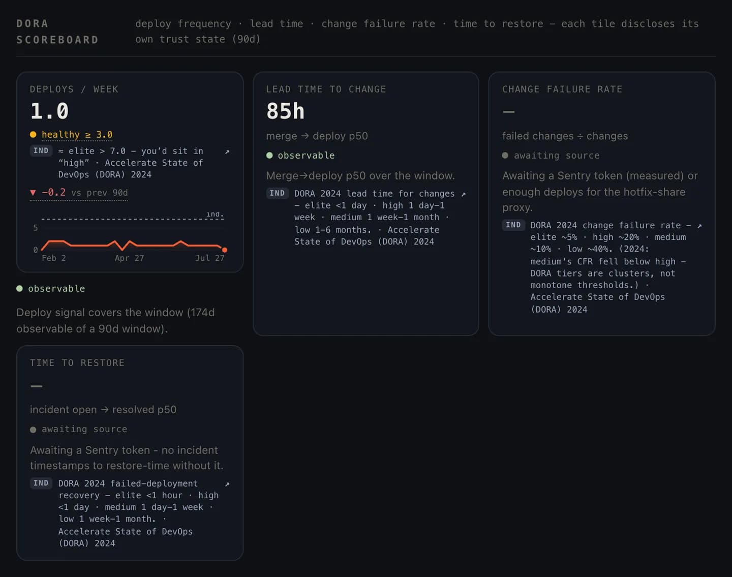
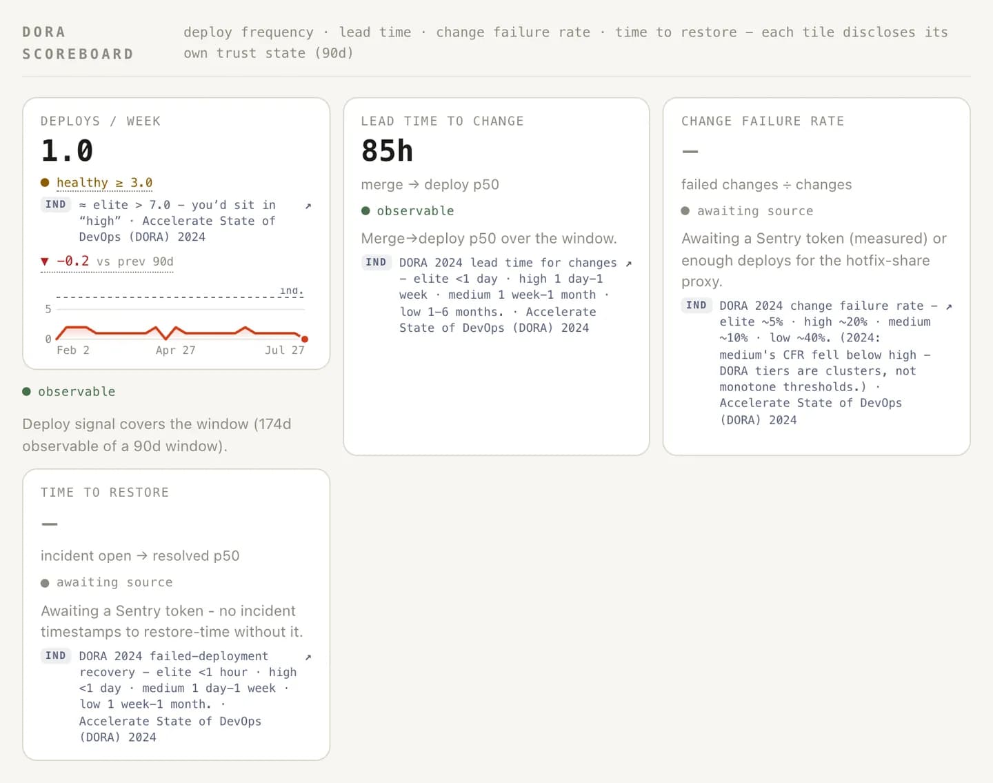
How to run one: the receipts format
- Check last retro's experiment first. Before anything new: did the fix we chose move the number we chose it for? This is the accountability loop that makes the whole practice compound. It cuts both ways, too, because the team gets to see its own good calls confirmed, not just its misses.
- Three charts, maximum. Each framed as a question: "review wait doubled in week two - what happened?" More than three and you're hosting a dashboard review, which is a different meeting with worse energy.
- Let the person closest to the queue narrate. The chart says pickup spiked; the person who was drowning in review requests knows it was the release freeze plus two people out. Data locates, humans explain.
- Leave with one experiment, sized to one iteration. Skip the five-item action list. One falsifiable change with a number attached: "reviews first, before new work, for two weeks; we expect pickup p75 to drop." A decade of DORA research points the same direction (strong performers work in small batches with fast feedback), and that applies to process changes too. Small experiment, fast readout, next retro.
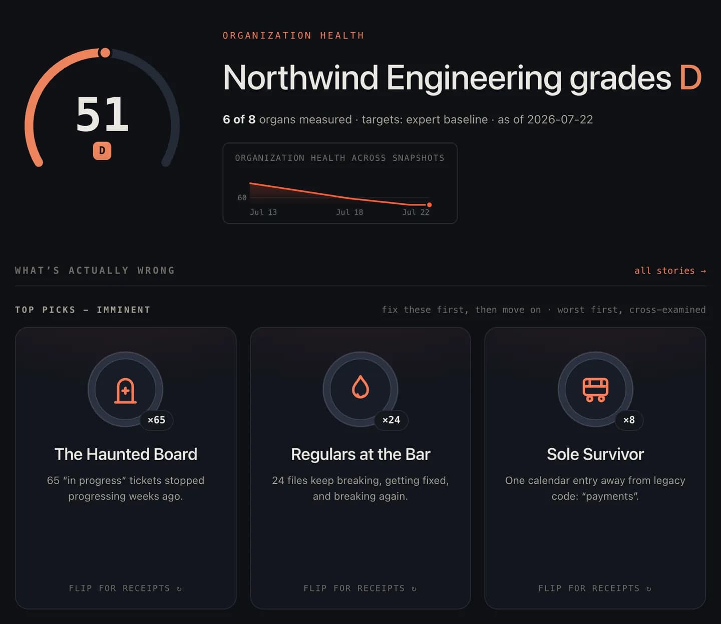
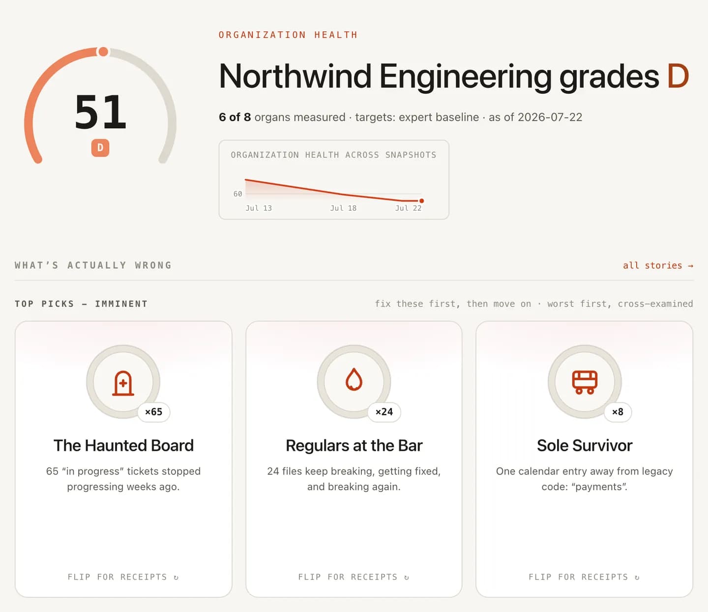
Guardrails: receipts without blame
The failure mode is obvious and fatal: data enters the room, safety leaves. The guardrails below are how you aim the numbers so that never happens.
- Numbers are prompts, never verdicts. The chart opens the question; only the room can close it. A retro where the chart is treated as the conclusion is just management-by-dashboard with extra steps.
- Aggregate at the system level. Covered above, worth repeating, because this rule is the entire ballgame. One name on one chart and the honesty budget is spent for a quarter.
- Expect Goodhart, and rotate. Any number watched for months gets gamed; vary the charts as the bottleneck moves. The metric was never the goal. The queue behind it was.
- Let the qualitative data in too. "The data looks fine but this sprint felt terrible" is a valid, important retro finding. Timestamps don't measure morale; treat feel-versus-facts divergence as a retro topic in its own right.
Retros are the improvement engine most teams already have and already underuse - the slot in the calendar where change is allowed. Bringing receipts doesn't make the meeting colder. It makes it consequential: the difference between "communication, again" and "the pickup queue ate four days, here's the two-week experiment, and we'll know by next retro if it worked."
That loop of measure, discuss, change, verify is the whole delivery-metrics scoreboard doing its actual job: handing the team its next fix.
Frequently asked
What is a data-driven retrospective?
A retrospective where the conversation starts from delivery data (cycle-time stages, pickup queues, blocked-time, rework trends) instead of memory and mood. The data doesn't replace the discussion; it picks which discussion is worth having and settles what actually happened, so the meeting spends its time on why and what to change.
Which metrics belong in a retrospective?
System metrics, shown as trends: cycle-time stage breakdowns, PR pickup time, aging or blocked work, rework and reopen loops. What doesn't belong: any per-person count, whether commits, points, or ticket tallies. The retro's question is where the system leaked time, not who to blame for it; individual numbers end the safety the meeting depends on.
How much data should a retro include?
Three charts is plenty. Each chart should be a question worth ten minutes, like 'pickup time doubled mid-sprint: what happened?', not a report to admire. More than three and the retro becomes a dashboard review, which is a different meeting with worse attendance energy.
How do you keep a data-driven retro from becoming a blame session?
Three rules. Aggregate at the system level, never per person. Treat every number as a prompt, not a verdict: the chart says what happened, only the people in the room know why. And always check last retro's experiment first: data-driven cuts both ways, and the team deserves to see whether the fix they chose actually moved the number.